The importance of using design to achieve and sustain business success, is becoming more widely understood and recognised throughout many businesses and organisations. Research into design trends ensures that the use of design is relevant, market and consumer-driven, socially responsible and current. It is hugely important to be aware of trends, to ensure your business is at the forefront of innovation and remains competitive in an ever-changing and sometimes volatile commercial environment. Trends provide inspiration, guidance, knowledge and the power to make decisions that initiate change and can result in very profitable results. However some trends are short-lived and may in fact be just a fad – here one day – gone the next. Making strategic business decisions based on trends should be undertaken with a measured approach.
 Tweet me ‘ Design trends change more often than the wind, and slightly less often than my socks ’
Suleiman Leadbitter
Let’s kick off with some the current design trends, both new, and those that have strengthened and gained momentum over the last year.
“ Flat design refers to a style of interface design which removes any stylistic choices that give the illusion of three-dimensions (such as drop shadows, gradients, or textures) and is focused on a minimalist use of simple elements, typography and flat colors. “ [ Source: Wikipedia ]
Flat design remains increasingly popular in 2014 after an emergence in 2013, following the huge change toward flat design of user interfaces (UI) in app and web development, which has also filtered into design for print and other mediums.
[ Source: shutterstock.com ]
Flat design has replaced skeuomorphic design (say that 3 times fast!), where applications and UI were previously designed to look like real objects (think Apple iOS interface pre-iOS 7). The change to flat design has resulted in a more simplified approach, intended to make design solutions increasingly easier to interact with. 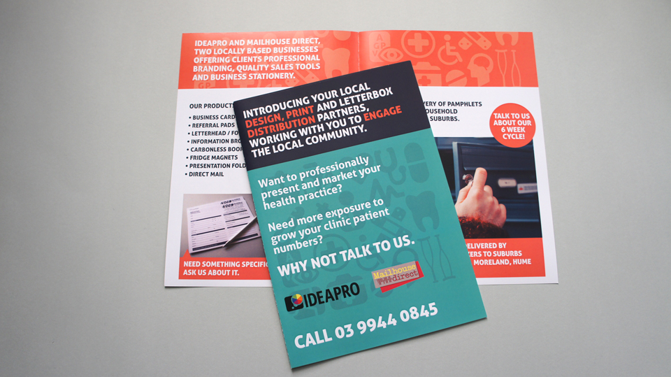 Example of flat design vector icons in a recent direct mail campaign with Mailhouse Direct
The use of effective imagery has long been associated with good design, but with the rising popularity of Instagram and smartphone photo apps, images with a filtered look are everywhere you look and aren’t going anywhere fast. (I must admit I’m guilty of the odd Walden effect on our pet cat pics once or twice!) Filtered images are those that have been modified in post-production, such as image colour, saturation, brightness, textures etc, to create a particular look and feel.  Example of filtered imagery used in iBag DryCleaning Promotional Flyer.
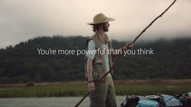
Conversely, authentic images that contain people and other subjects in candid settings are also increasing in demand, steering towards a desire for a deeper, more emotional connection through design. Apple have demonstrated this connectivity through their recent advertising campaign ‘You’re more powerful thank you think’
On the flip-side of flat design, handiwork is coming through in a big way. Where type appears hand drawn or sketched and detailed illustrations have a focus on craftsmanship. Drawings are on their way back in – and boy have we missed you!  Example of wedding invitation set, Rob & Stella.
Branding has gone back to basics. Previously, logo design was very intricate, with unique elements and it would be the main brand identifier. Companies are now moving away from this level of detail and reliance on a logo to be the principle focus point, instead they are using visually simplistic clean fonts that often work against a white or light background. Think Ebay, Google and FedEx. Honesty, transparency and broader appeal is achieved through this design approach, as they appear stripped back and real. The logo has become a secondary identifier and the user experience has now become the focus. Apple (can you tell we’re Apple nuts!) have done this on their website where their logo is small and positioned in the top left corner with authentic imagery, now synonymous with their brand, taking centre stage instead.
![]()

Examples of back to basics logos developed by IDEAPRO.
What are your thoughts on these design trends in 2014 – or know of any others? Feel free to share your thoughts in the comments below. If you have a current project you’d like to have a chat about, talk to us about incorporating some of these trends into your next project. We’d love to explore what could be achieved for you.
Creatively Yours, Rosie & Anthony @ IDEAPRO

Comments