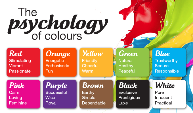
A human eye can pick up about 10 million colours, they shape moods, evoke feelings and create an overall aesthetic. Pretty amazing how something so small can make such an impact on how you perceive something, right?
Every brand has a voice, a story, a personality and colour is a great way to express it. In light of this, it is important to know which colours will suit your brand and portray it’s meaning appropriately.
When utilising colours in graphics, logos and style guides for your brand, it is not only important for the colour palette itself to work together well, but for it to be an excellent and appropriate representation of your brand’s meaning. The first step is to have a clear understanding of what that means for your brand – whether you are wanting to evoke intelligence, power, happiness, loyalty? Utilising the psychology of colour, there are specific shades that embrace these sentiments more than others.
For instance, with Valentine’s Day, we all understand the colour red represents love, passion and desire. However, red also expresses excitement and energy. Furthermore, yellow being the colour of happiness and sunshine – these two colours combine to make orange which demonstrate a balance of both energy and happiness. Usually beverage and food stores will contain these warm hues such as Coca Cola, McDonald’s and Corona Extra.
If McDonald’s were to use their branding and packaging in the colour black for example, it would not be as suitable. This colour demonstrates the elements of power, luxury and sleekness. Mmm… doesn’t really connect to the McDonald’s brand does it? Their pricing strategy is low-cost, and aims to attract a warm, family friendly audience. Therefore, using the colour black would not be a very successful in communicating their brand messaging to their consumers.

Graphic: BCR Painting
When choosing colours for your brand, think about how you want your audience to feel. Purple can represent royalty and creativity whereas blue expresses trust, wisdom and stability. Just because your brand represents a lot of qualities does not mean you should use every colour that it represents. Our creative director, Anthony Lo Grasso at ideapro recommends “using no more than two colours as you don’t want to confuse customers”. It’s important to brainstorm and highlight the key messages you want to share with your customers and choose your colours from those ideas.
For instance, although the well-known beauty loving brand, Garnier, wants their customers to trust (blue) them looking after their hair and skin, and bring them happiness (yellow) in regards to their appearance with their products, their brand’s core colour is green. This represents nature, health and growth as they wish to highlight how healthy and beneficial their products will be for their customers, and this is in turn will build trust and bring happiness without the need to use multiple colours. This is reiterated through their fruity and greenery driven graphic imagery, to emphasise one of their core messages being that their “strength comes from nature”. When you think of Garnier right now, how do you feel about their brand?
We are aware there are an endless realm of colours to choose from, however planning out thoughtfully which ones to use to represent your brand will help communicate a clearer message to your audience that will have the desired effect.
If you would like to know how we can help inject style and colour into your brand identity, be sure to get in touch with our team.
Please help us spread the word and share this post with your colleagues and friends.
Categories
Submit a Comment