Image: www.pantone.com
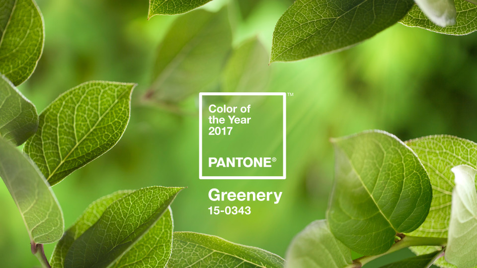
Each year Pantone releases a colour of the year – for 2017, it’s Greenery – a refreshing and revitalizing shade, symbolic of new beginnings. According to Pantone, “Greenery symbolises the reconnection we seek with nature, one another and a larger purpose.” We couldn’t agree more and feel that this is the way the world is heading.
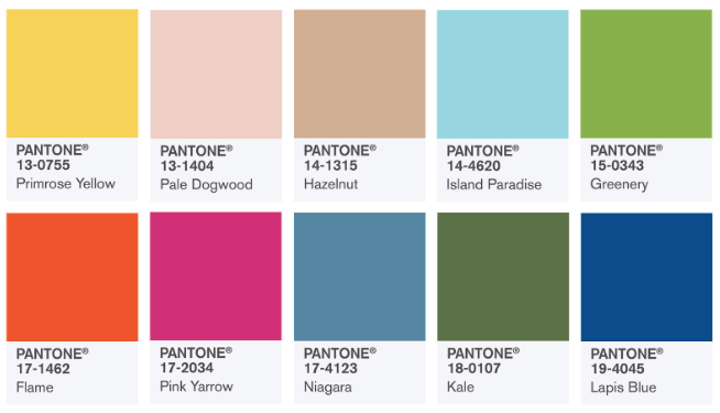
As designers, we love nothing more than to research current trends and see how they may apply to our work, and that of our clients. In line with the announcement of colour of the year, we are excited to share the (U.S) Spring 2017 fashion colour palette incorporating Greenery, which include colours that have a mix of vitality, relaxation and the great outdoors. They are all hues that surround us in nature.

Image: www.pantone.com
These colours will be seen on runways next year. As fashion often feeds into and influences so many industries – interiors, furniture, media, art, architecture, design, why not take inspiration of forthcoming trends, and incorporate it into your new year projects? It may just give your project the edge it needs to stand out and present your company as progressive and on trend.
What do you think of Greenery and the inspiration colour palette? Be sure to share your thoughts in the comments below.
______
Talk to us about how we can incorporate this colour inspiration palette into your next campaign. Contact our team.
Creatively Yours, Rosie & Anthony @ ideapro
Submit a Comment