A change is as good as a holiday they say – and this applies to your business logo as well. Throughout time, many brands have updated and upgraded their logo – you may ask why change what isn’t broken? Below we outline the top 3 reasons to refresh your logo, and explore why other leading brands, our clients and our business have done the same.
“Over time, as your business grows, it will become increasingly important for your logo to instil feelings of value and trust in your customer through a professional and current look and feel.”
Your logo is the visual representation of your brand to the marketplace so it should reflect where your brand is at today – including reflecting your values, positioning and connecting with your ideal client. You don’t need to necessarily design a logo from scratch, rather revitalise your existing logo with a fresh new take.
1: Staying on trend
Over time, our tastes change and so do our customer’s tastes. What might be fashionable today, won’t be in a few years’ time and if you don’t update your logo, it may subconsciously appear to clients and prospects that your company is not progressive, fresh or willing to adapt to new styles.
2: Revitalisation
If you’re going through a period of stagnancy in your business, with sales levelling out or dropping, new competitors entering the marketplace, or conversely your business is experiencing growth, has new management, is entering new markets, or offering new products and services – it is a good time to consider updating your logo to graphically depict a shift in your business’ position and portray an up-levelling of your brand.
3: Lack of initial investment
When starting out, small businesses are either not in a financial position to, or unwilling to invest in a well thought out brand and logo development process. This can result in a basic look and feel, which is fine for the initial set up stages of your business and it will serve its purpose. Over time, as your business grows, it will become increasingly important for your logo to instil feelings of value and trust in your customer through a professional look and feel. If your initial ‘budget-style’ logo doesn’t represent this, it may be time to consider an upgrade using a professional graphic designer. You can read here a previous post where we share why working with a graphic designer is a good idea.
“ A logo acts primarily as an identifier – something people can associate a company with at a single glance. A successful logo should be appropriate, scalable, memorable, distinctive, practical, and simple.” – David Airey –
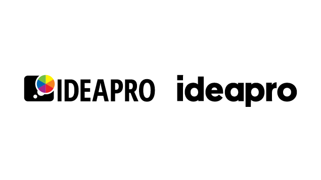
Here at ideapro we decided it was time for us to evolve with a fresh logo also.
So why the change for us?
After launching ideapro back in July 2013, over three years ago now, a lot has changed since then. We have improved systems and processes, have clarity around our ideal clients and product & service offering. Just as importantly, we’re as passionate as ever about reflecting current trends in design that are stripped back, yet effective.
Our logo needed to reflect these changes, so here is the before and after.

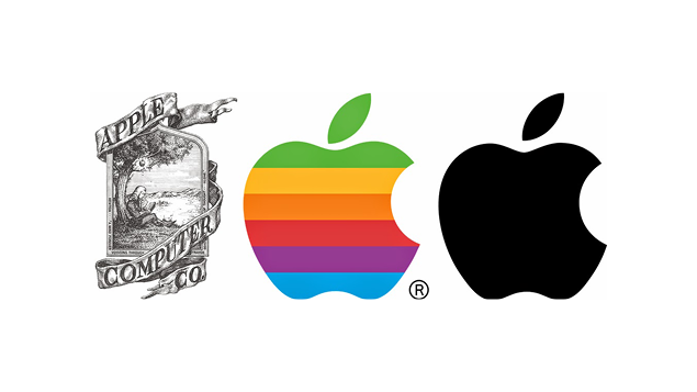
Here is an example of a well known brand, Apple, who has also evolved their logo over time:

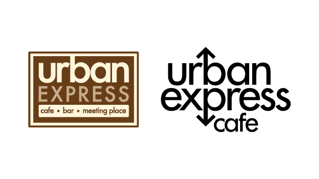
Some client examples, Wattyl Protective Coatings and Urban Express Cafe, who selected ideapro to update their logo to better reflect their own change in direction:


Tell us what you think of the before and after logos in the comments below!
If you would like to know more about what’s possible to refresh, reinvigorate and evolve your business logo, be sure to get in touch with our team.
Creatively Yours, Rosie & Anthony @ IDEAPRO
Categories
Comments